Fancy Packaging
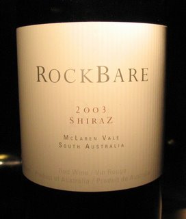
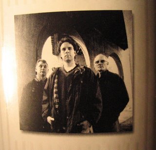
 Hate to say it, but wine is a commodity and producers need to sell their wares, no matter how bad they are. This leads to "fancy packaging" trying to seduce the potential buyer with nice or trendy labels and some tired old cliches. I think I hooked a culprit tonight, although it was recommended by the LCBO's bi-monthly buying guide. The Rockbare Shiraz, 2003 looks good on the shelf, a minimalist but classy front label and then a hip picture of the crew responsible on the back. Hey, this guy in the middle looks cool - must make a young, vibrant wine. eh?
Well, there's nothing really wrong with this wine, but, then again, there's nothing really right either. An insipid sipper. Just goes to show, don't expect the wine to taste like the label!!! The marketing didn't stop on the bottle either - go to rockbare's website and if you want a good laugh, read their tasting notes of this exact same wine as you drink it - I have never seen such hyperbolic crap! On second thoughts, don't bother to drink this wine as that means you are buying into their trap and you are throwing your money away....
If I could make wine, I would be embarrassed to actually put my picture on something like this...maybe the cool guy should go back to wine school.
The Verdict: OK.
Value: Not there at $17.
cheers!


0 Comments:
Post a Comment
Subscribe to Post Comments [Atom]
<< Home